Sandra Freimuth
Head of People and Communications
Welcome to Hauck Aufhäuser Lampe!
Our new logo
The first important change will be reflected in our name: From now on, the new bank will be named Hauck Aufhäuser Lampe. This was important to us. Together with Bankhaus Lampe, our branch network will grow, but above all we are gaining even more colleagues who are passionate about banking and their customers. In concrete terms, this means that we are significantly strengthening our service offering and regional presence in private and corporate banking and asset management.
And we feel a personal responsibility to ensure that you - whether you are a private individual or an entrepreneur - always receive tailored solutions, honest advice and reliable implementation of your concerns. This is what all employees of the bank stand for, now and in the future. And this is also what our new logo stands for.

The basic shape of the new logo is derived from our old Hauck & Aufhäuser logo, the rhombus. It gives rise to a highly dynamic formal language that can be excellently adapted to a wide variety of formats, media and brand spaces. The use of fine lines creates an exciting contrast that underscores the brand's claim: the highest product quality and outstanding individual advice with the expertise of over 225 years.
Our new logo combines both this idea and our respective initial letters. After extensive preparation, we will now fill these guiding principles with life. In a unique way, the HAL Supersign graphically condenses what the Hauck Aufhäuser Lampe brand stands for: Interlocking competencies, united under one roof, in one house - self-confidence and high standards - modernity and timeless value.


Keeping the tried and tested, but creating something new
Those who knew our old colors will think: Not much has changed. Exactly! Because we have found that they suit us perfectly. We have merely optimized our color world for increased digital use and, in addition to some new, trustworthy blue and gray tones, we have also expanded the accent colors. After all, there should be enough gray outside.

Modern and simple
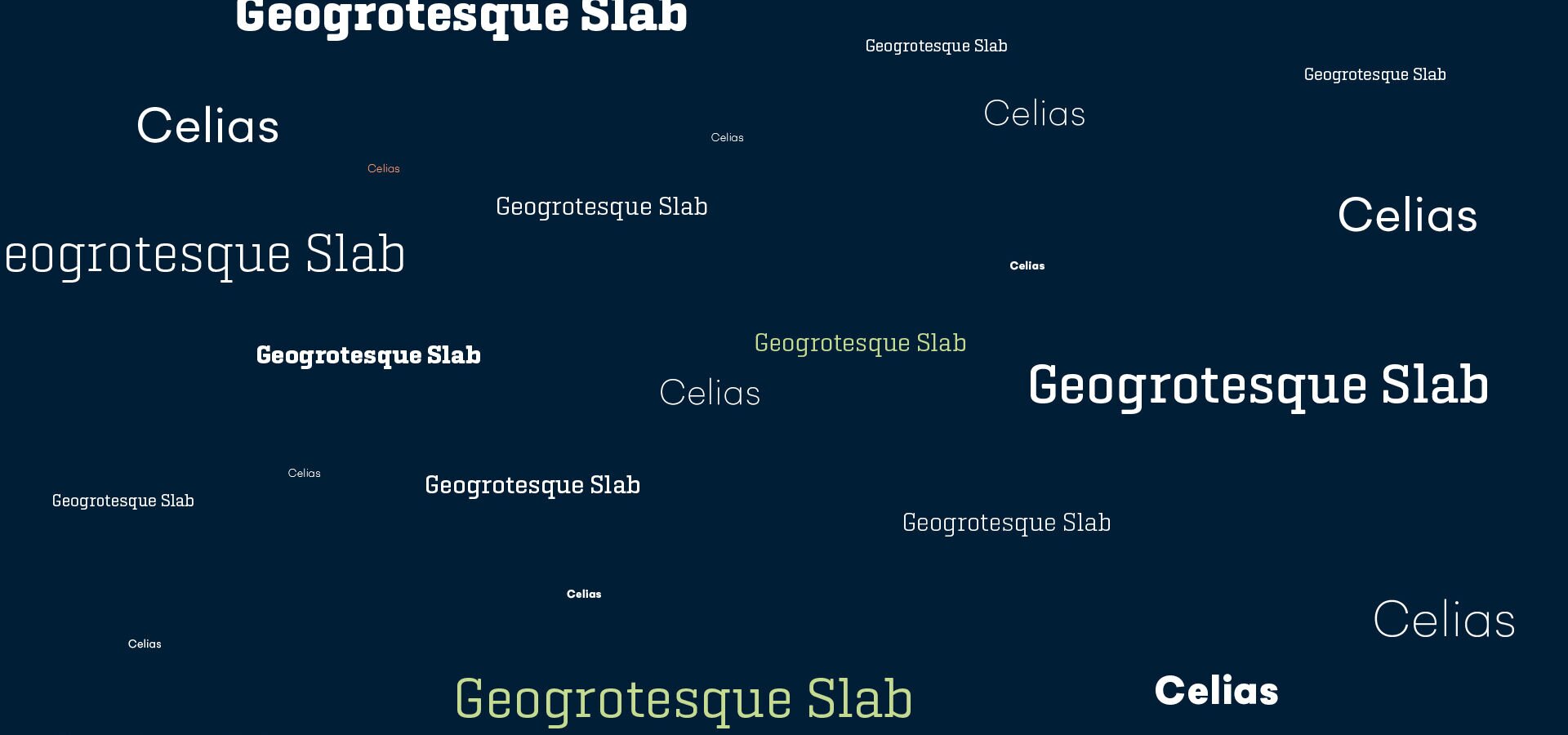
The Geogrotesque Slab is used for headlines. Celias is used for sublines and copy texts. The combination of serif and sans serif typeface looks modern, characteristic, bold and can be used very well, especially digitally.
In this sense

Saint Elmo's München: Creative agency and communication partner.